Overview
The objective of this project was to create a complete branding and visual identity for Stratosphere, an innovative airline concept that integrates the luxury of a five-star restaurant within its service. This project aimed not only to reflect the unique experience of dining elegance at high altitudes but also to elevate the overall passenger experience through thoughtful design.
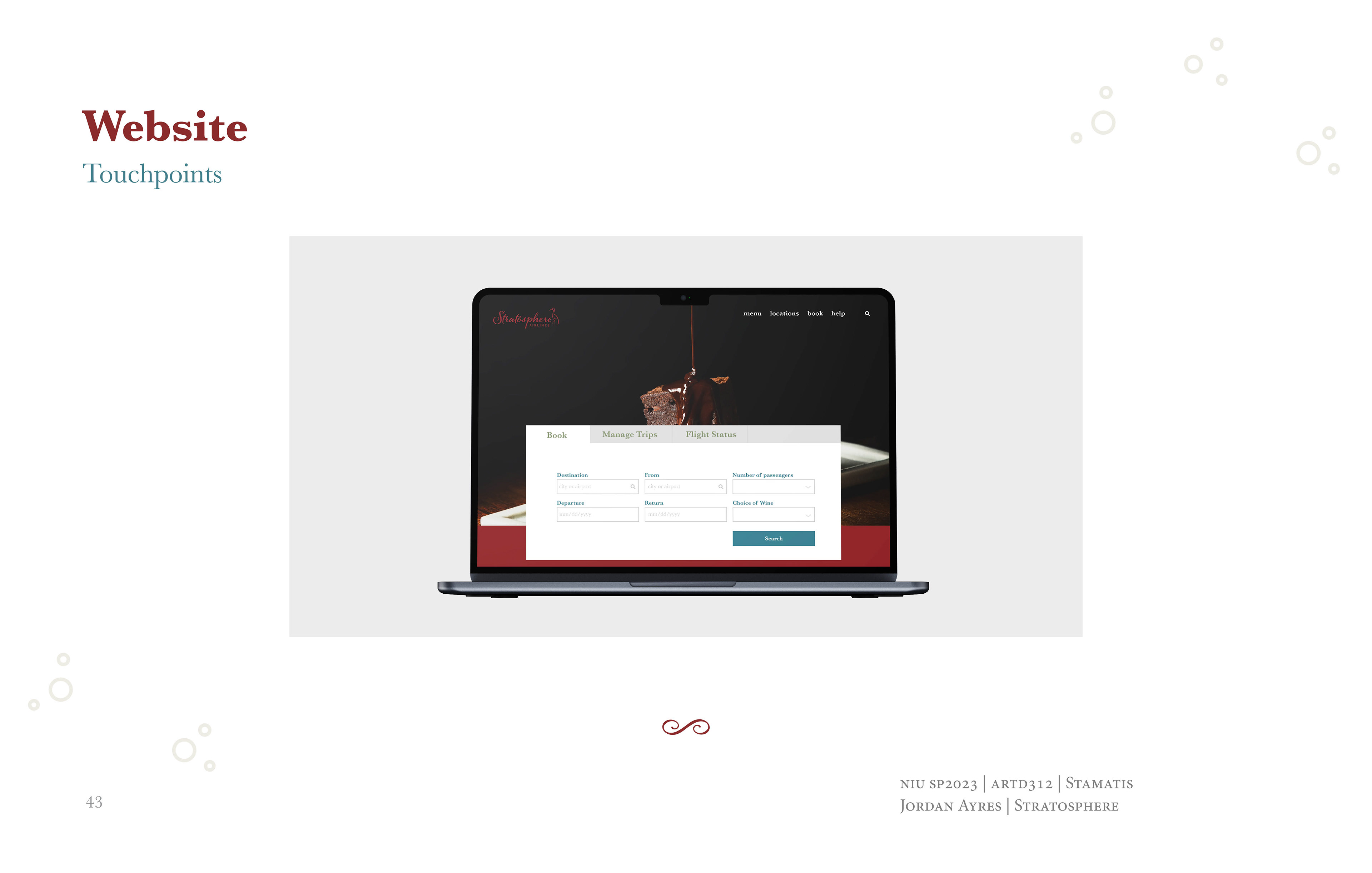
The design process involved developing a visual identity that communicates luxury, elegance, and exclusivity.
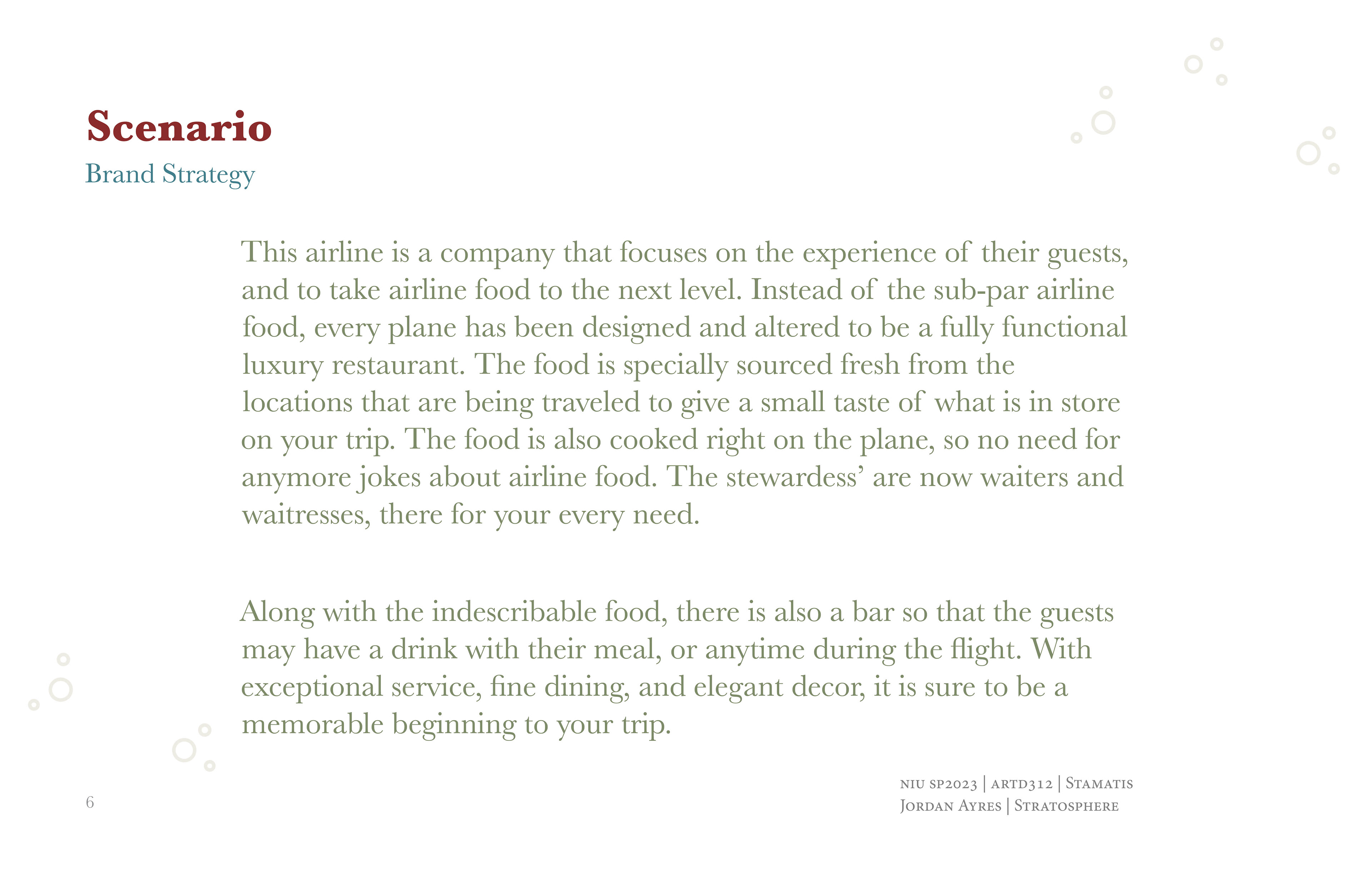
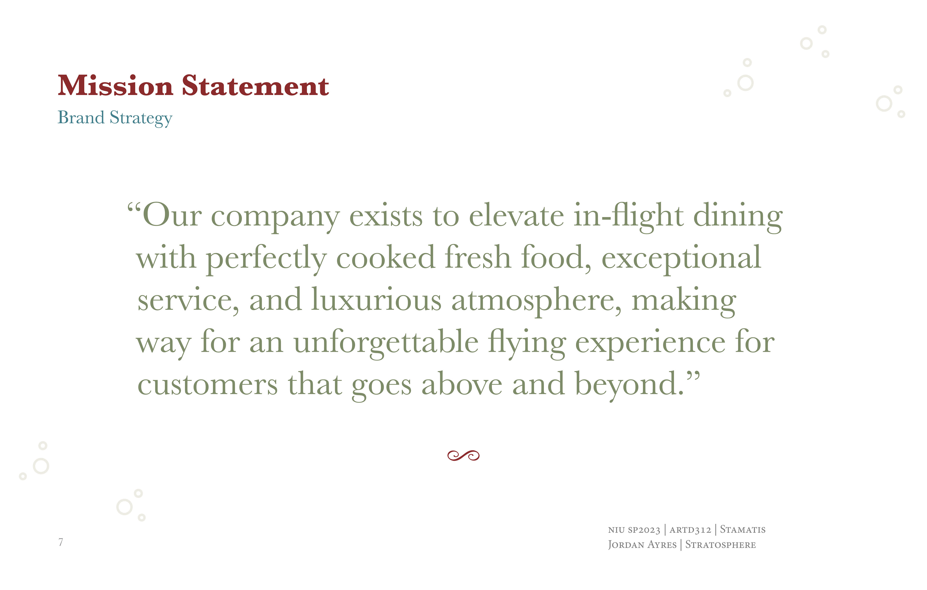
I was able to personally develop the brand scenario of this fictitious company, which include the mission statement, Audience, and descriptive attributes. I focused on the elevating the experience of air travel; literally. The brand developed into a luxury and sophisticated company that creates an unforgettable flying experience that goes above and beyond.
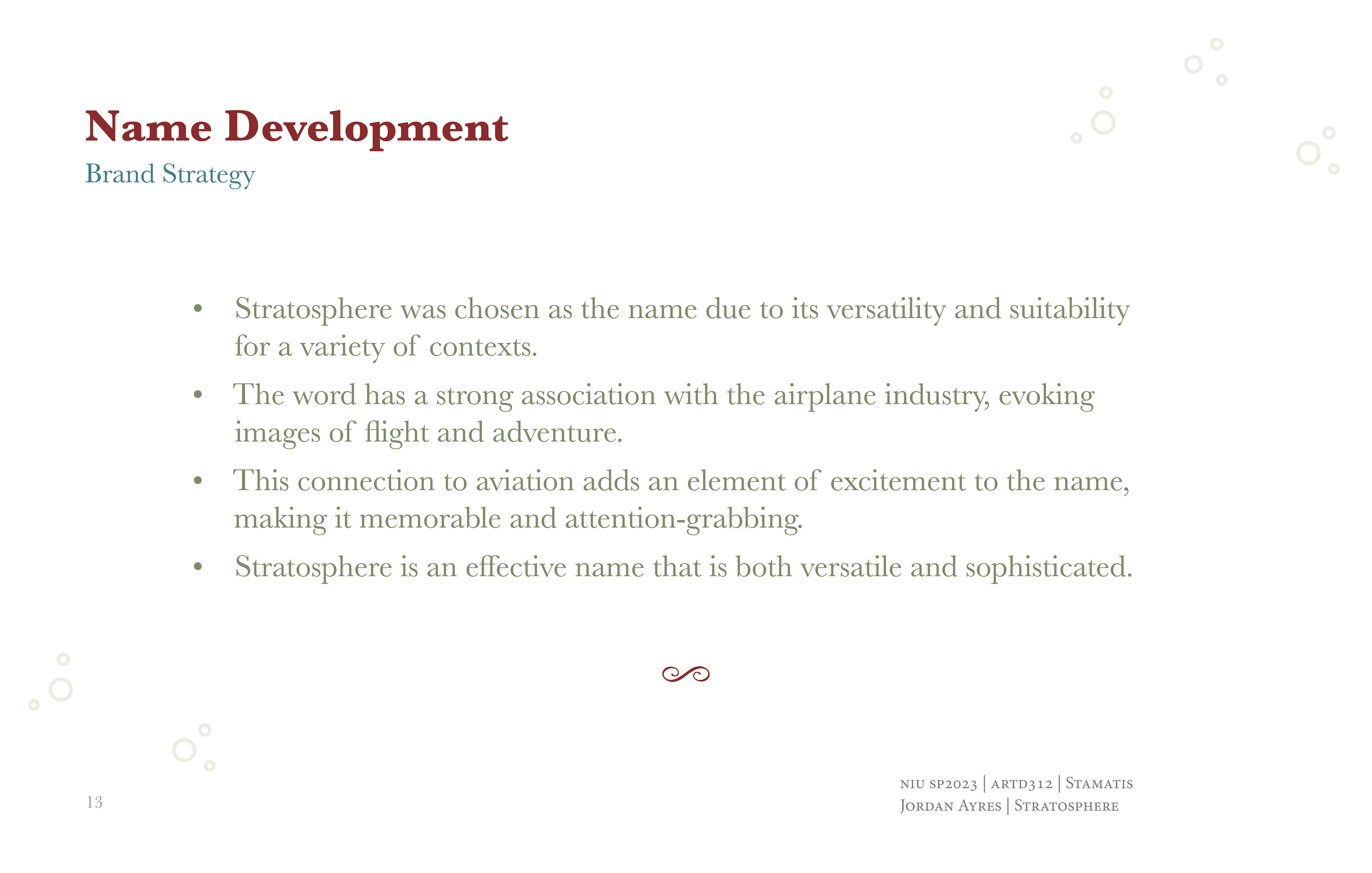
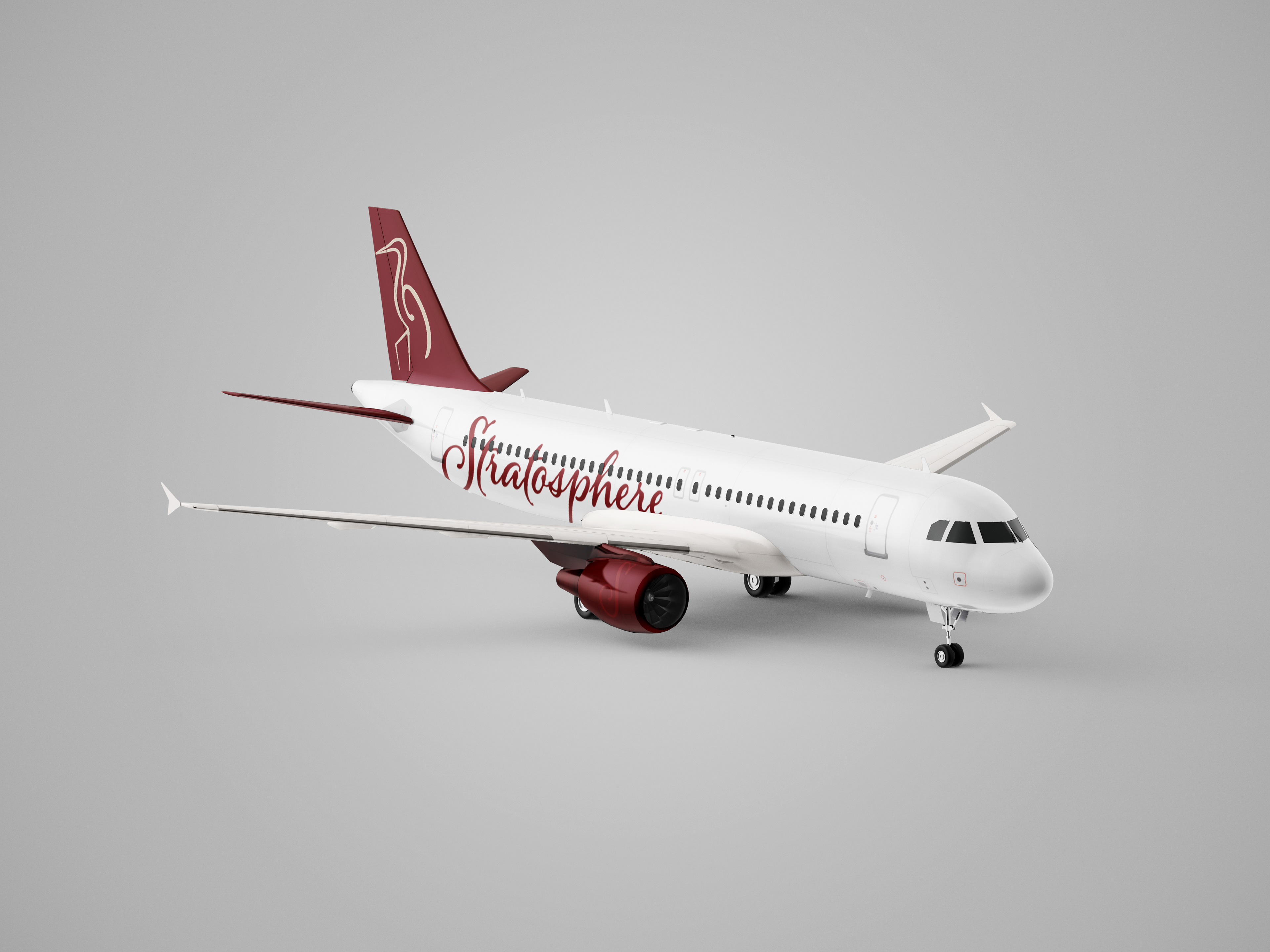
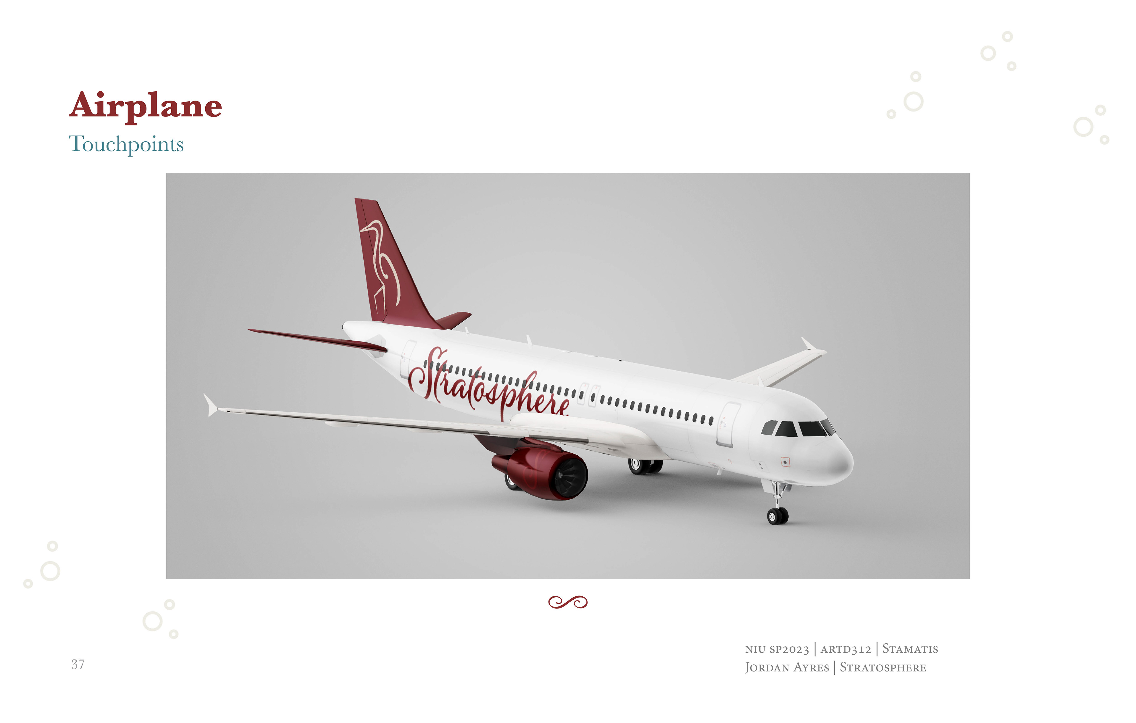
The name "Stratosphere" was chosen for its strong connection to flight and the sense of adventure it evokes, perfectly capturing the essence of the airline's unique offering. The term "stratosphere" refers to a layer of the Earth’s atmosphere, directly linking the name to aviation and upward exploration. This choice emphasizes the high-altitude dining experience the airline provides, blending adventure with luxury. The name is both versatile and sophisticated, aligning seamlessly with the brand’s aim to appeal to discerning travelers looking for an exceptional journey that goes beyond the conventional flying experience.
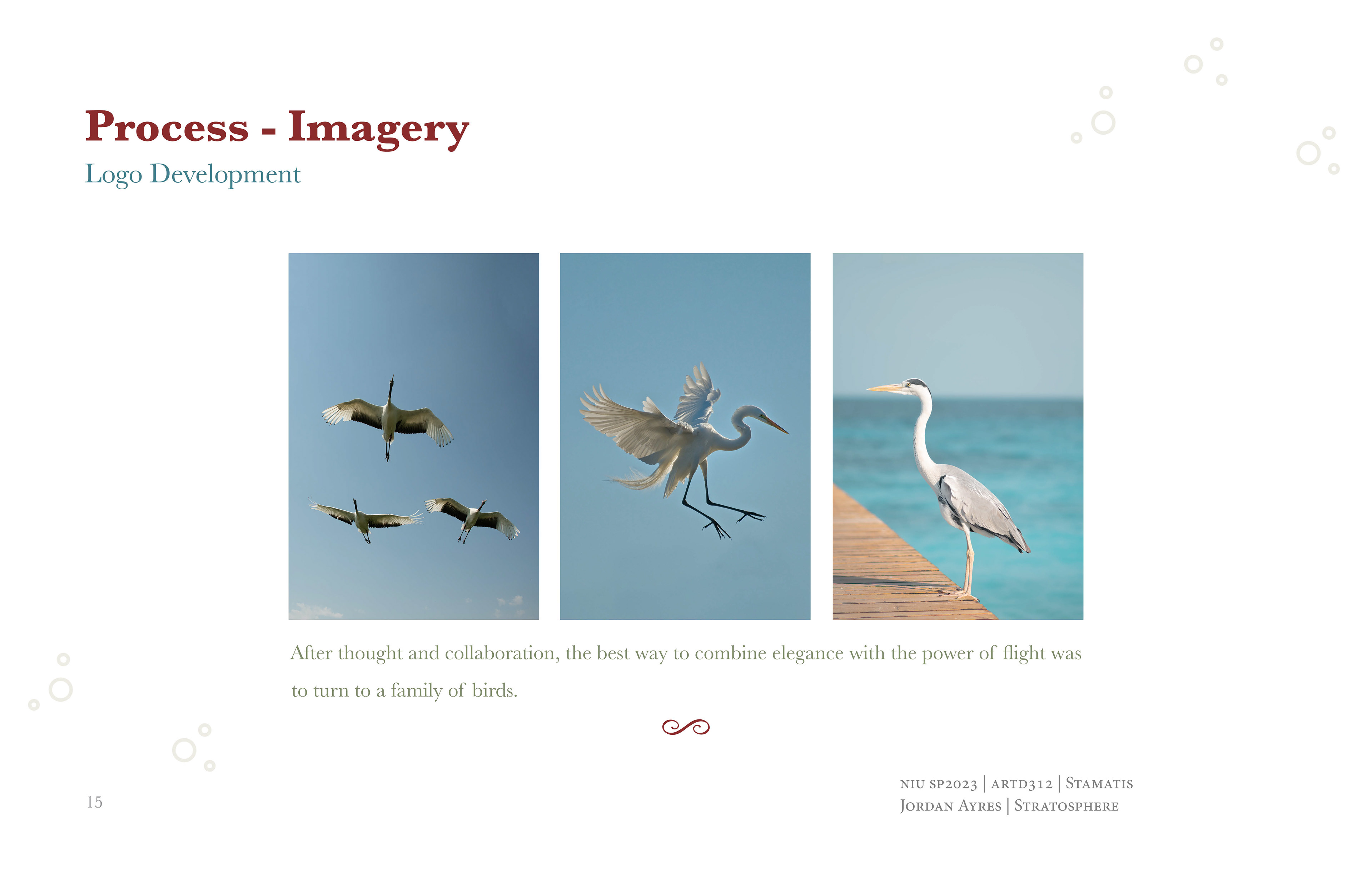
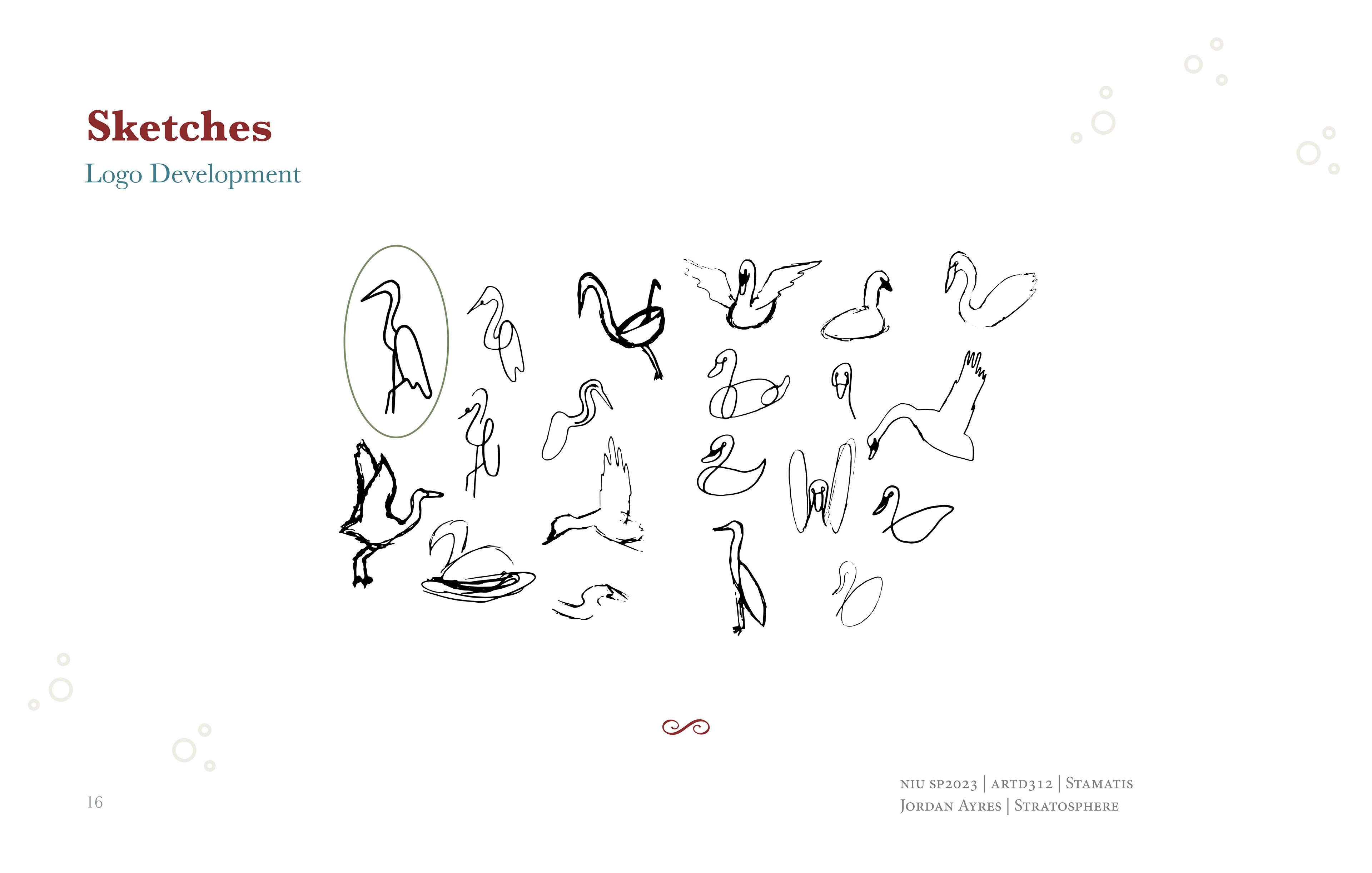
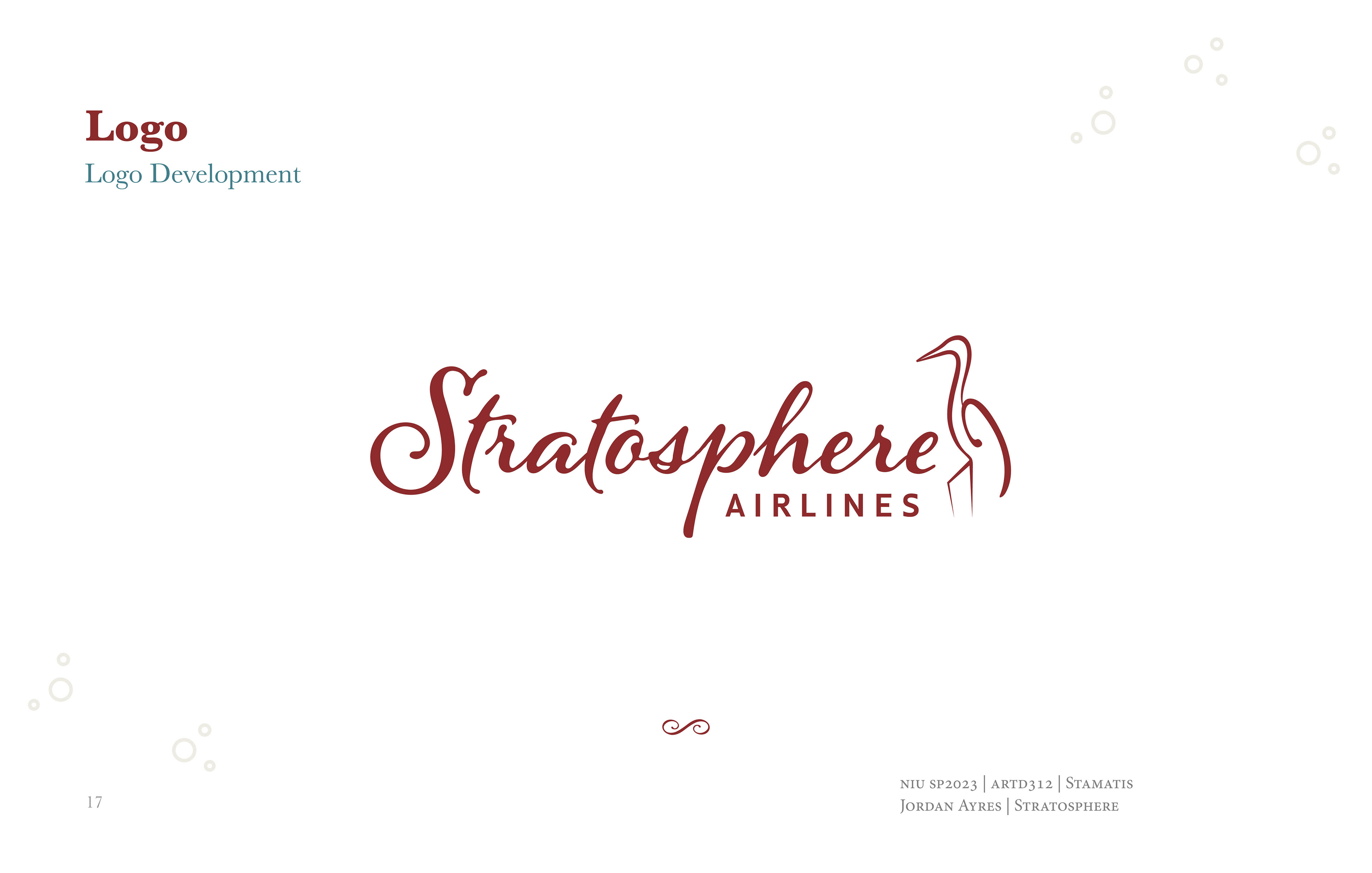
When generating ideas for the logo of Stratosphere Airlines, I aimed to embody the themes of flight and elegance central to the brand's identity. After exploring various symbols, I found inspiration in the elegant crane bird, known for its grace and elegance.
In the process of designing the logo for Stratosphere Airlines, I extensively utilized references to inform and inspire my sketches. Sketching with these references at hand enabled me to experiment with different configurations and details, ultimately guiding me towards a refined logo that elegantly integrates the essence of flight and sophistication that was directly related to the Stratosphere brand.
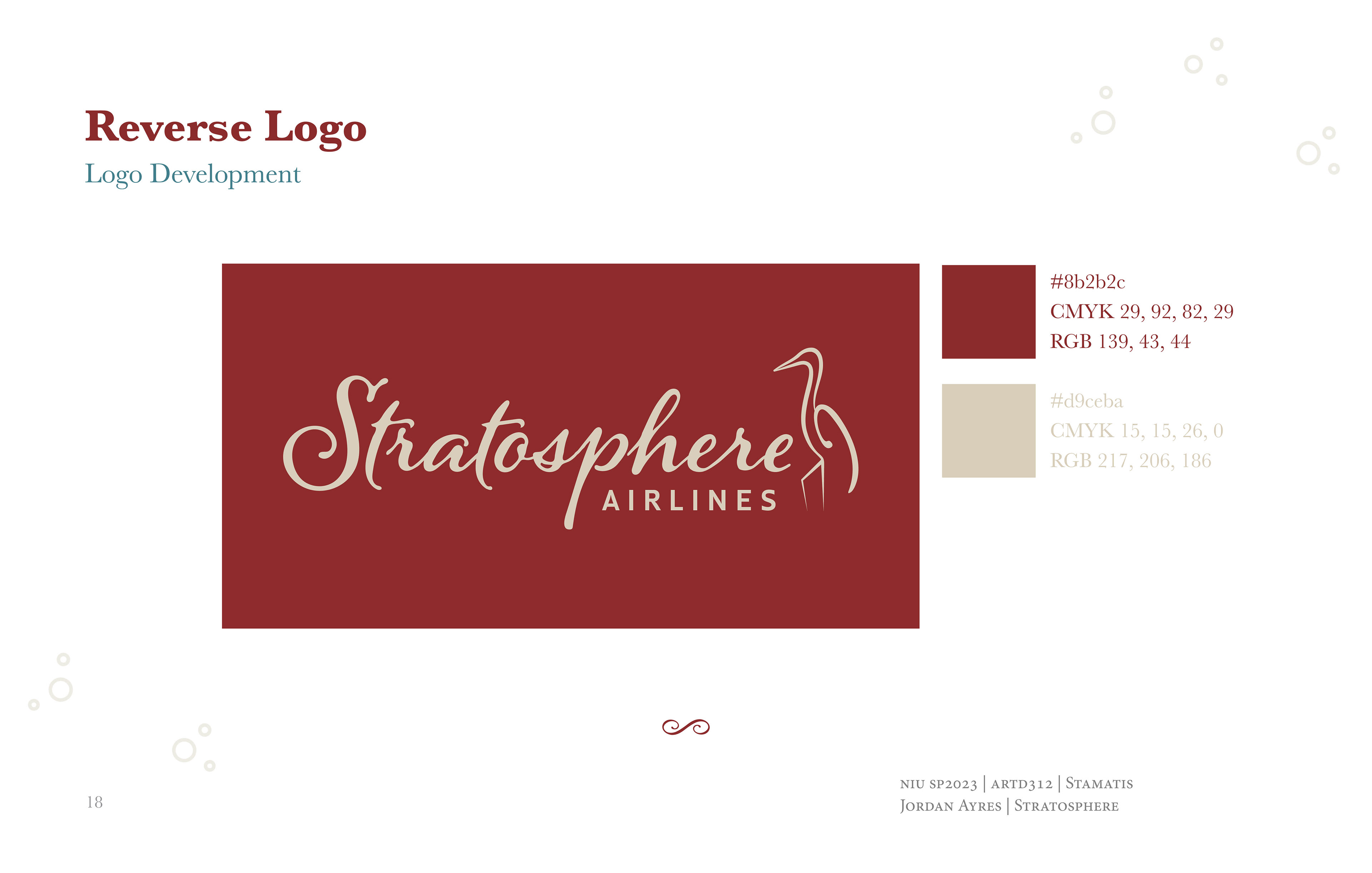
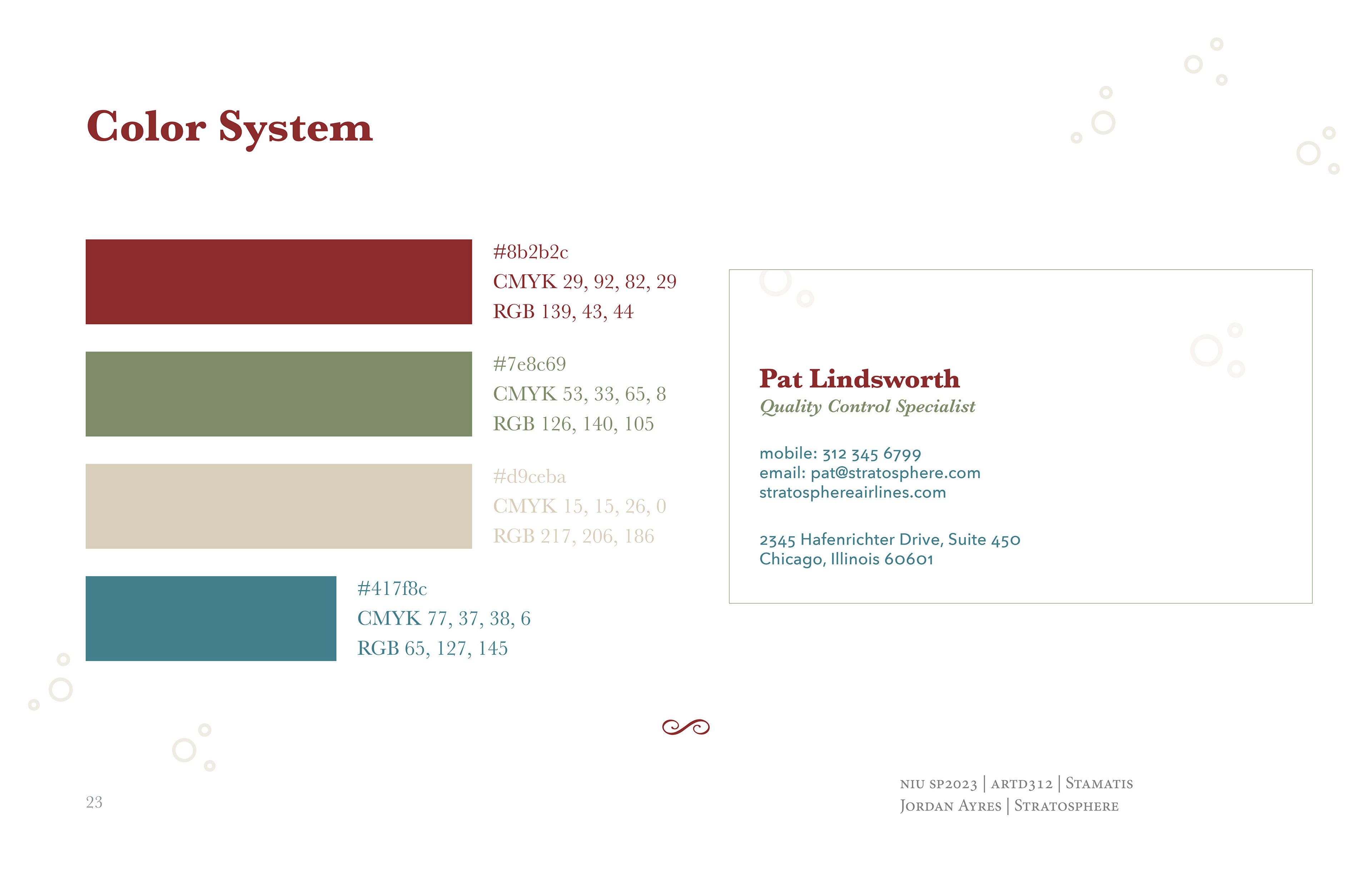
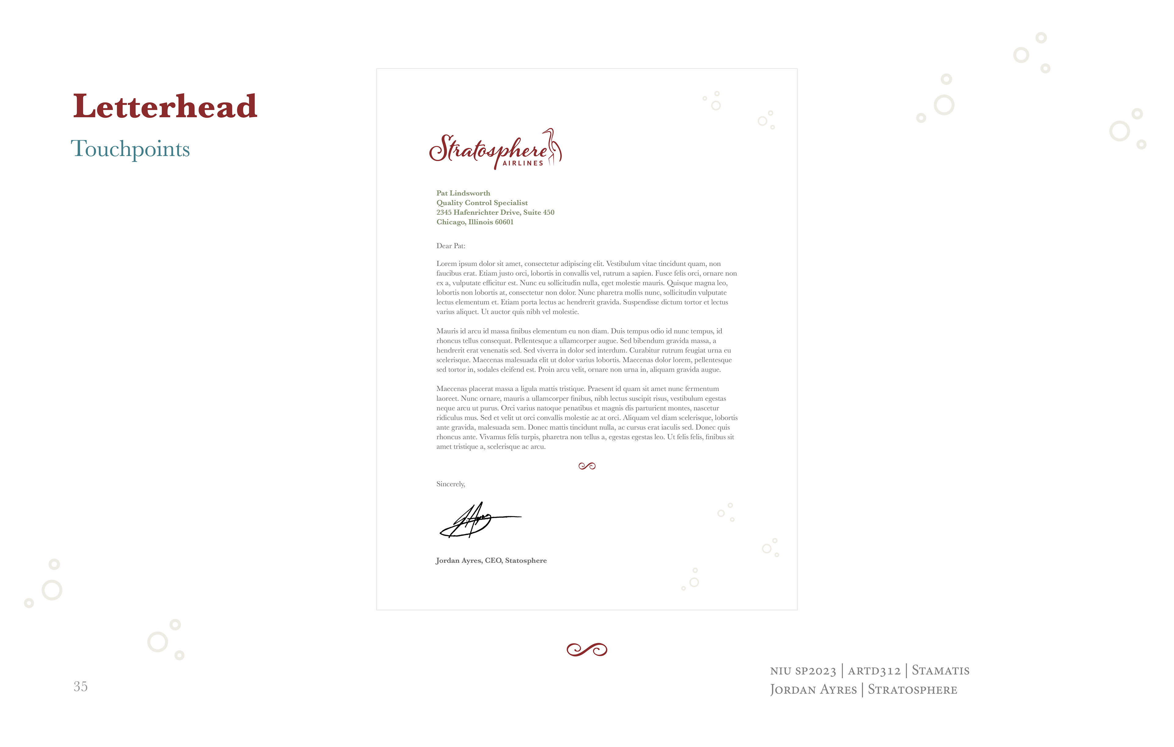
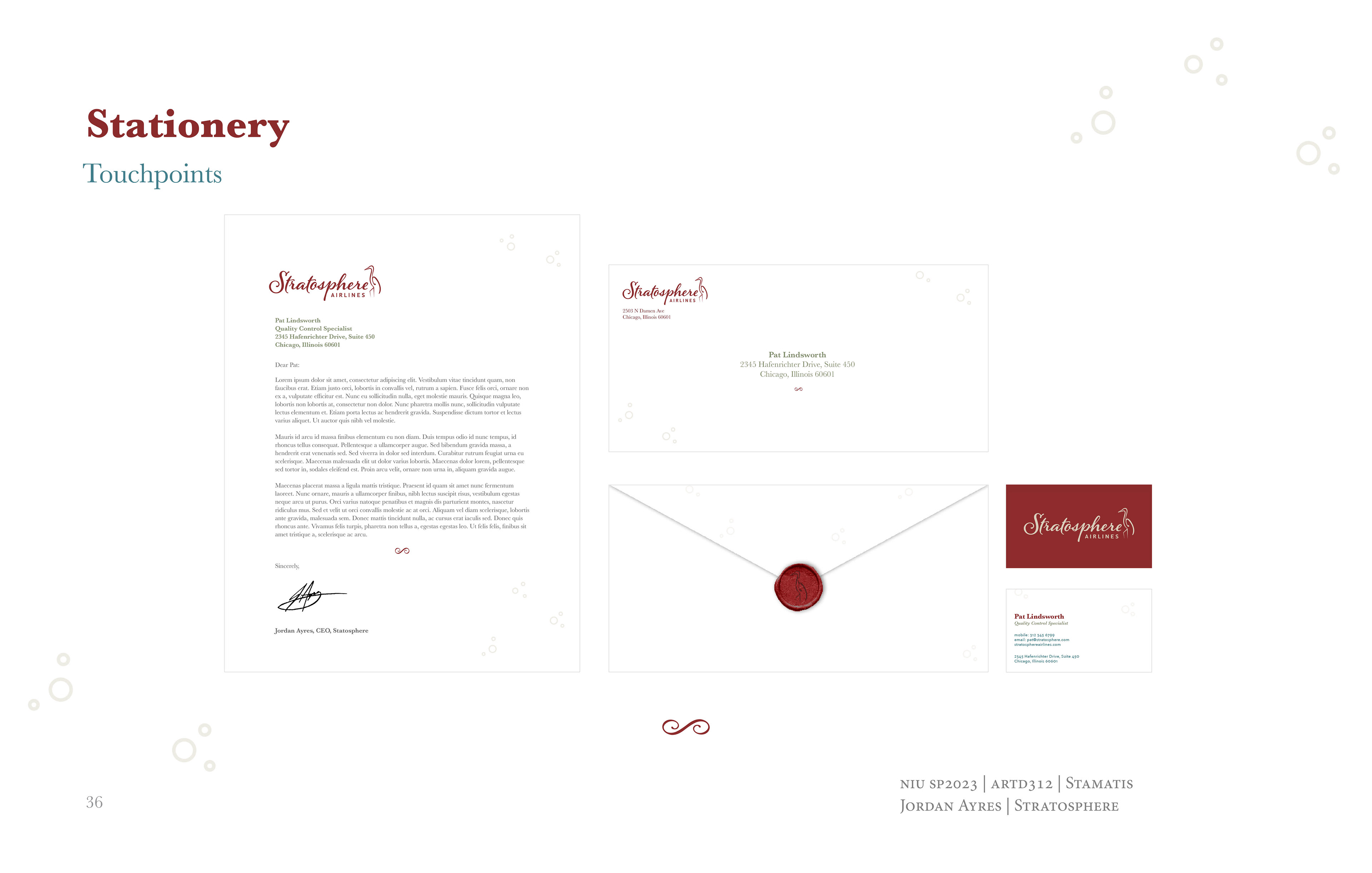
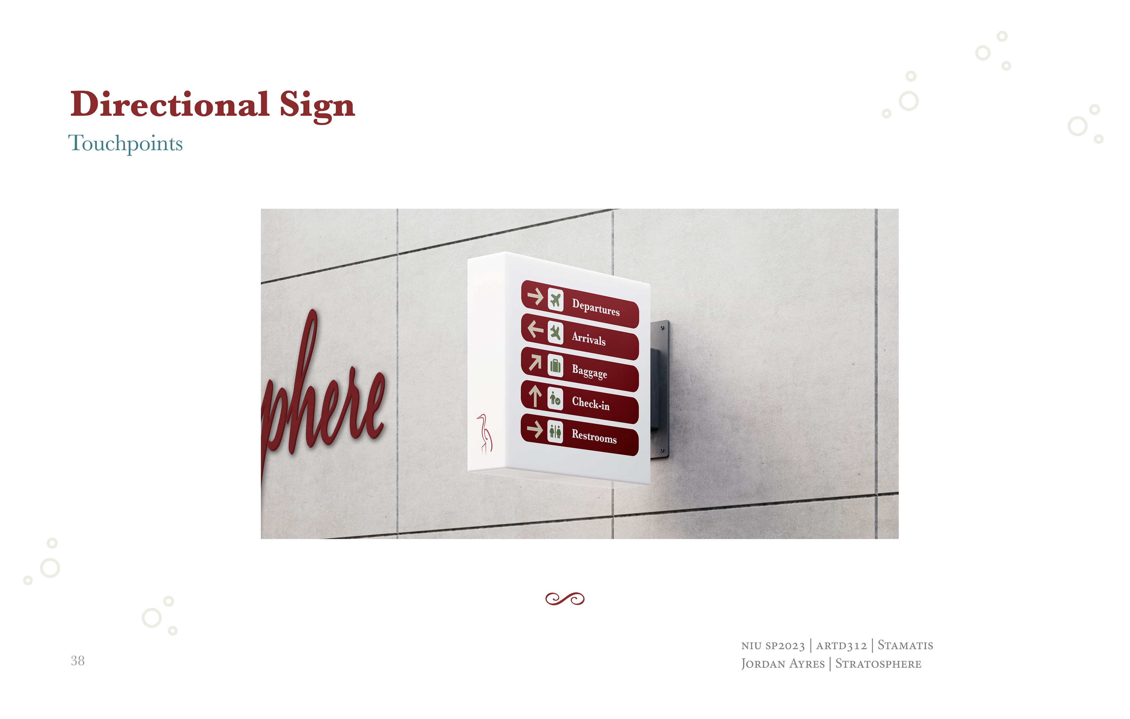
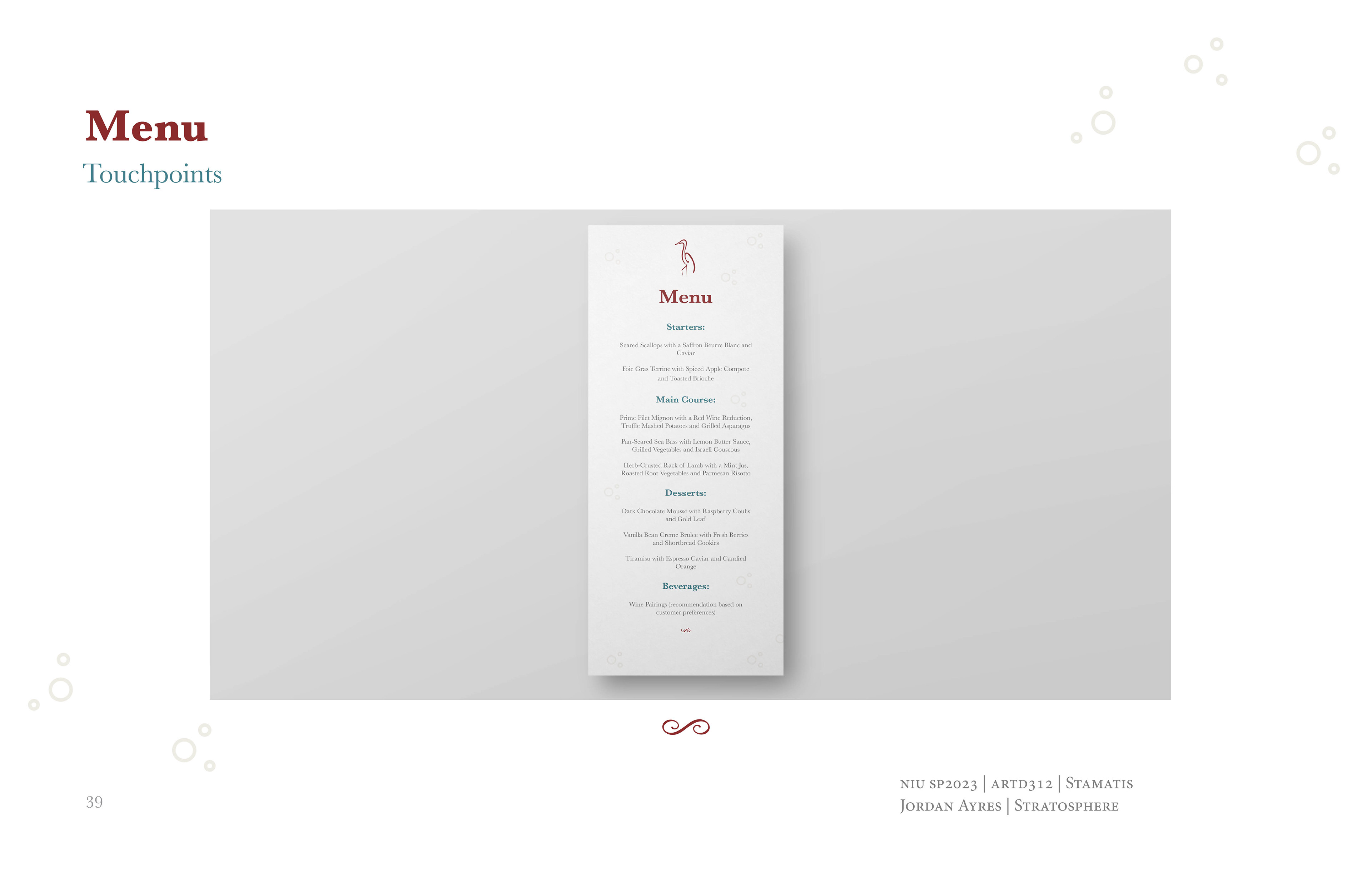
For Stratosphere Airlines, I designed a color scheme that combines classic restaurant colors with the essence of flight. The deep red brings a sense of upscale dining, while olive green adds a touch of earthiness. The soft tan offers a warm, neutral base, and I introduced a complementary blue to symbolize the sky. This palette merges the luxury of fine dining with the freedom of air travel, creating a cohesive and inviting visual identity.

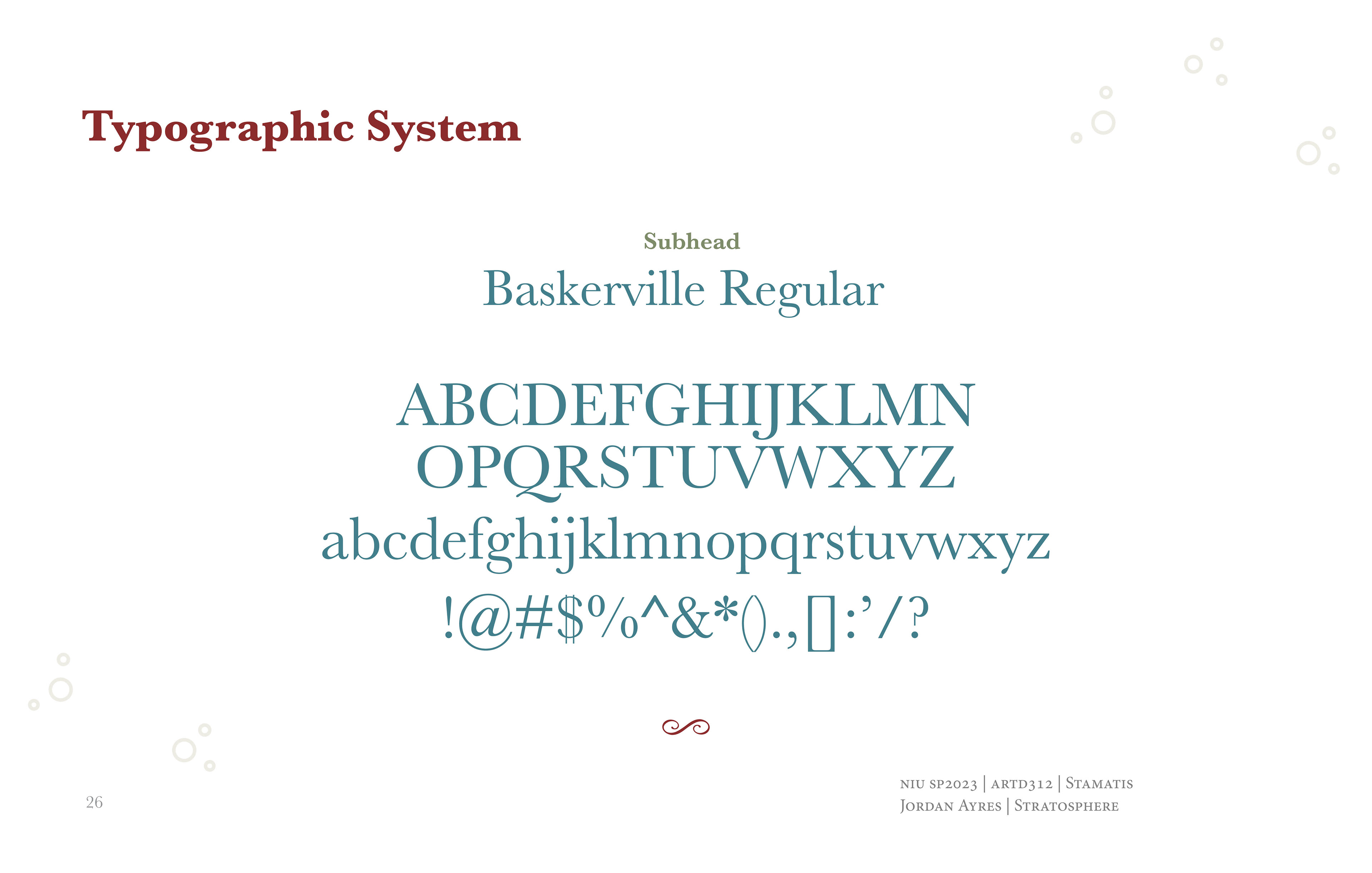
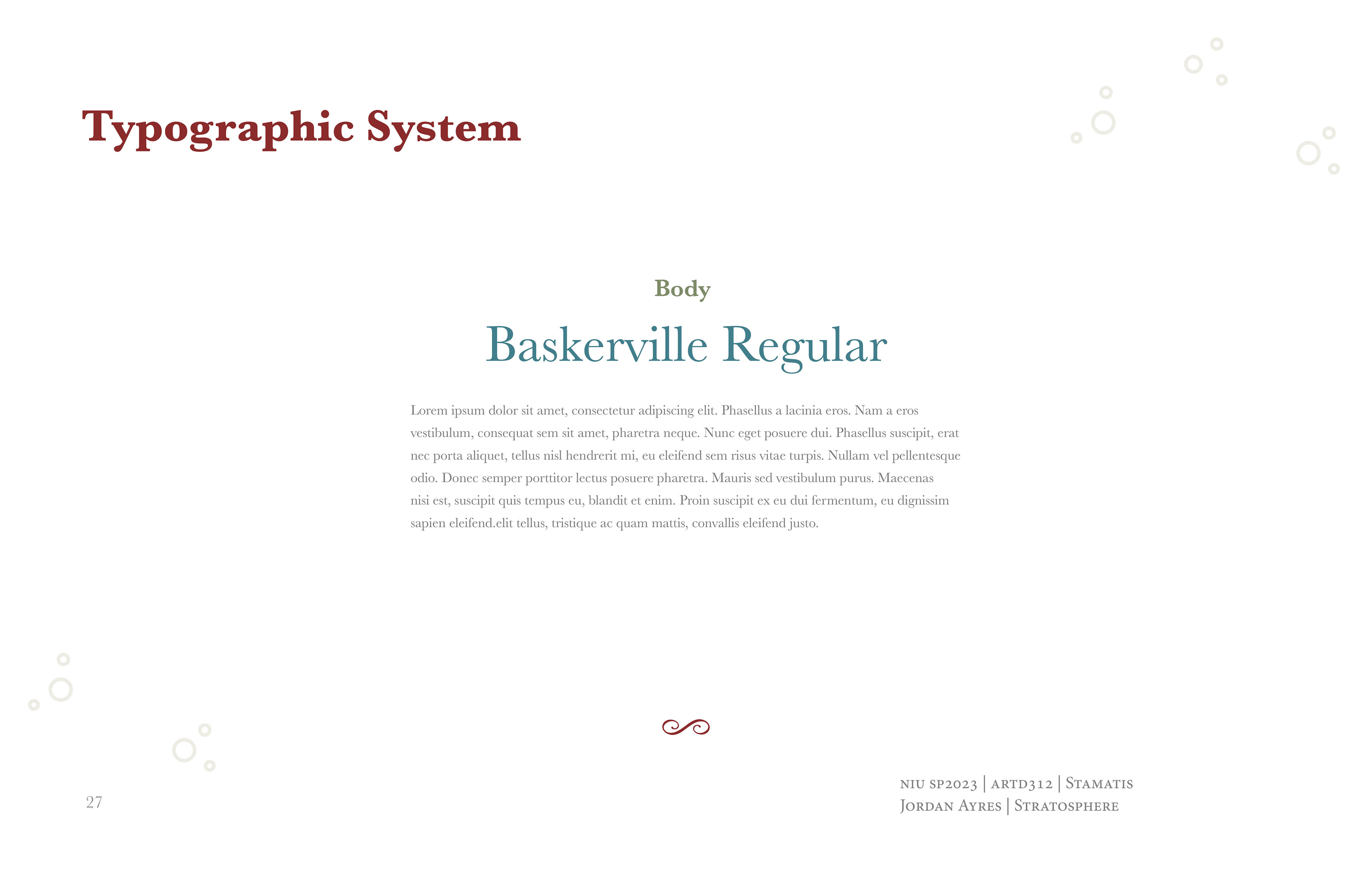
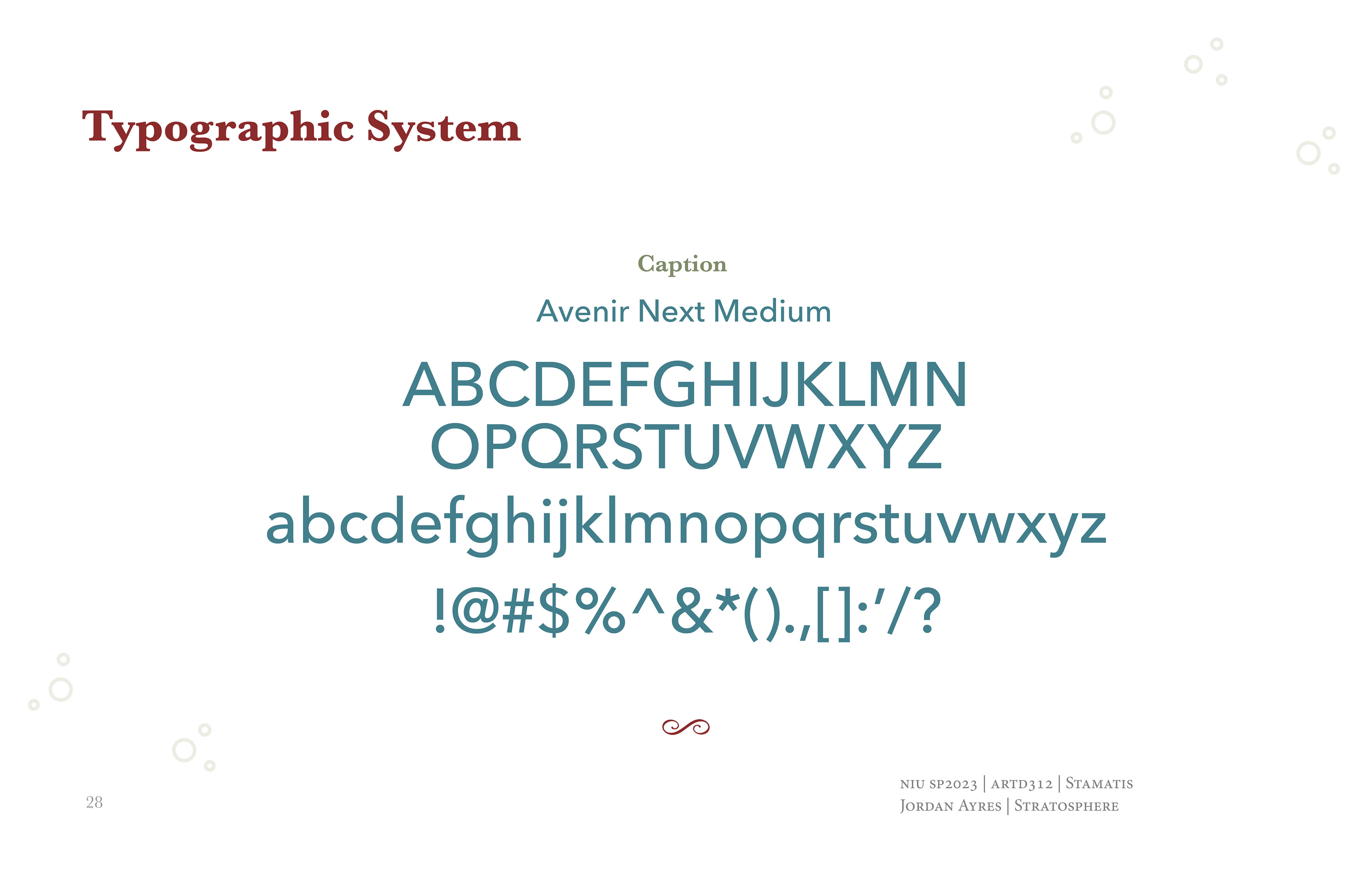
I selected the Baskerville font family for its main typography to embody the brand’s timeless elegance and sophistication. Baskerville is a serif typeface known for its sharp, clean lines and beautiful readability, making it an excellent choice for conveying luxury and high-quality service. To complement this, I chose Avenir Next for captions, a sans-serif font that contrasts nicely with Baskerville’s more pronounced serifs, ensuring clarity and modernity in smaller text.
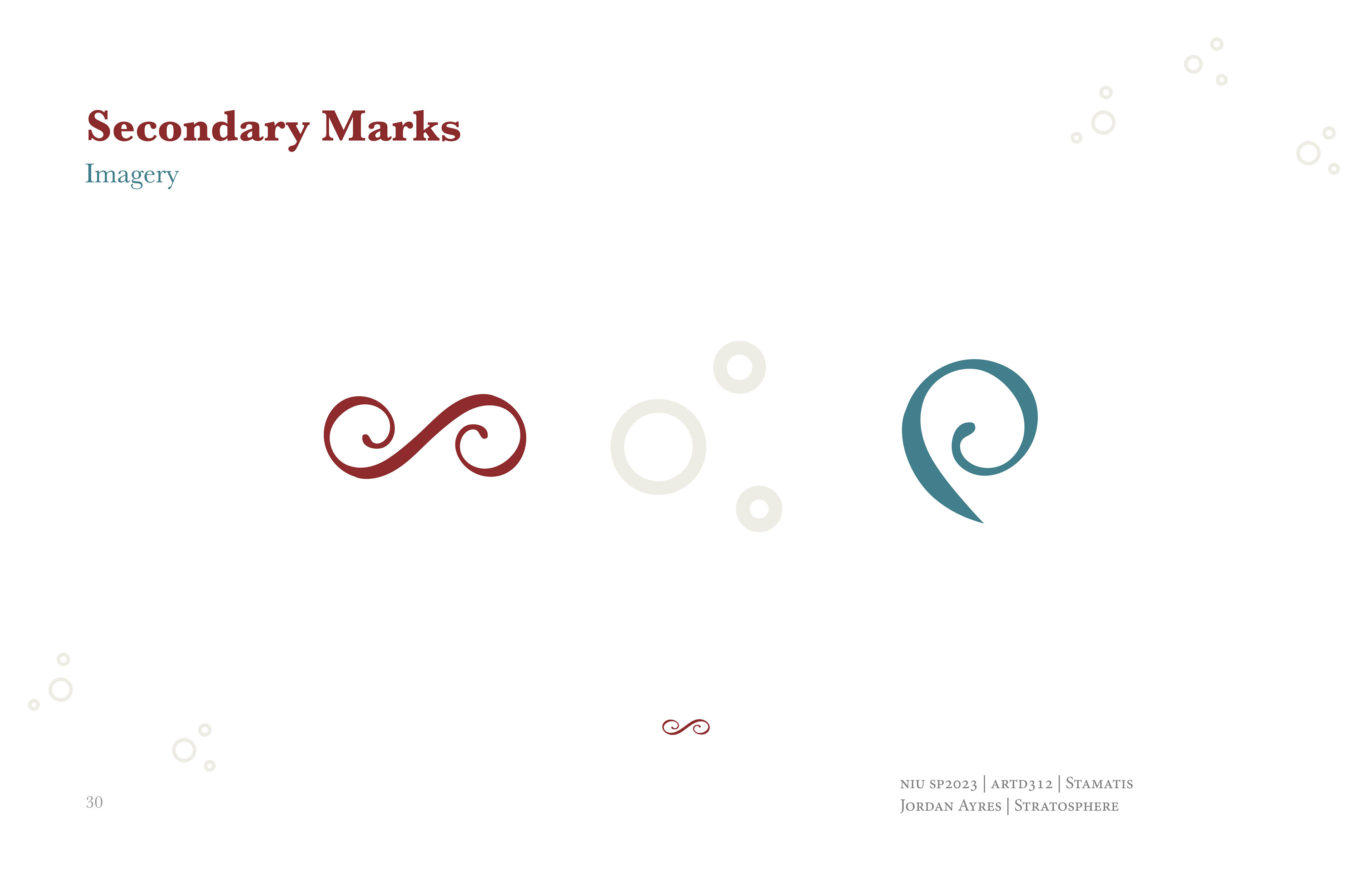
In enhancing the visual identity of Stratosphere Airlines, I designed secondary marks that complement the primary logo, providing flexibility across various applications while maintaining the brand’s sophisticated essence.
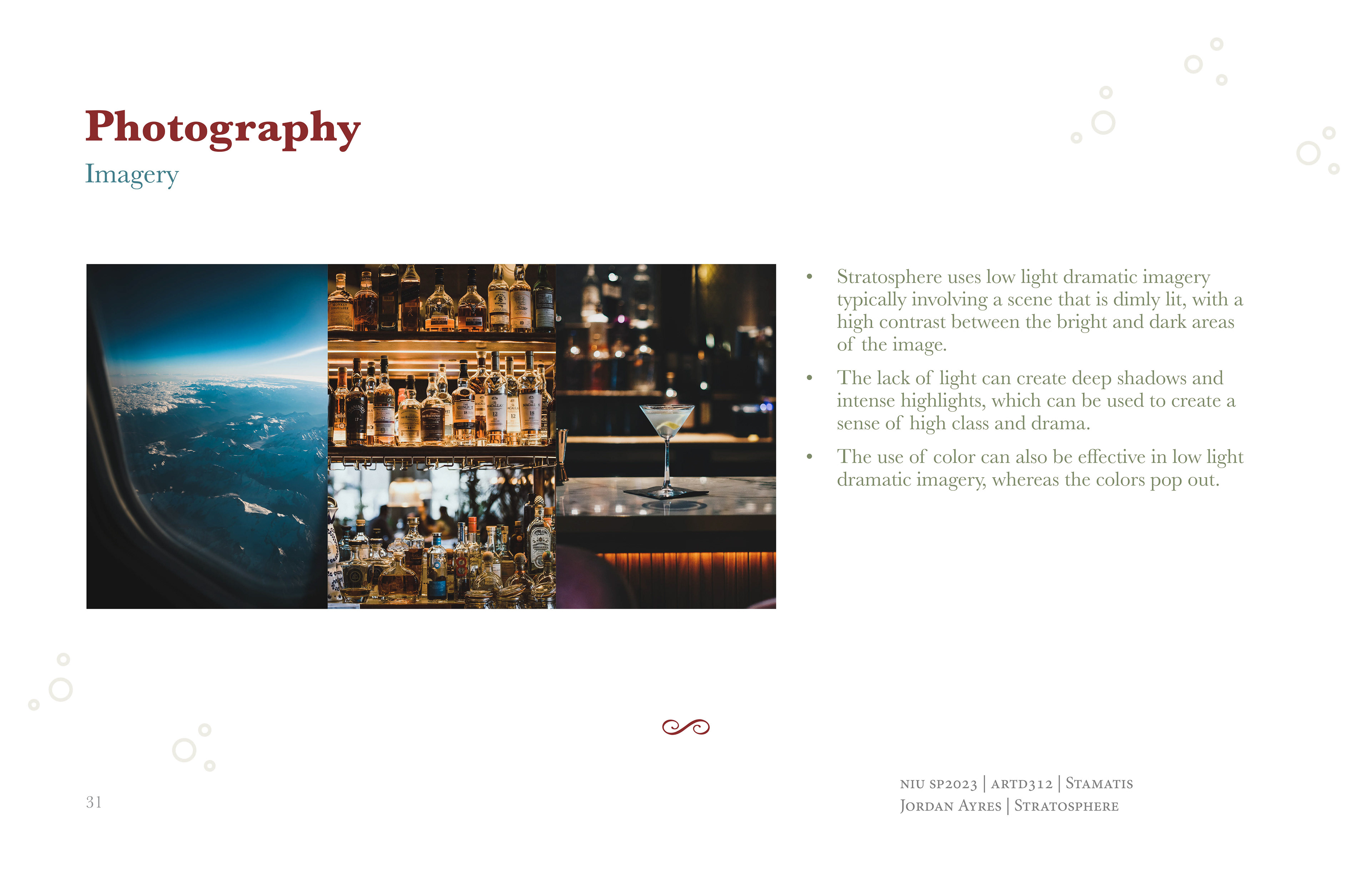
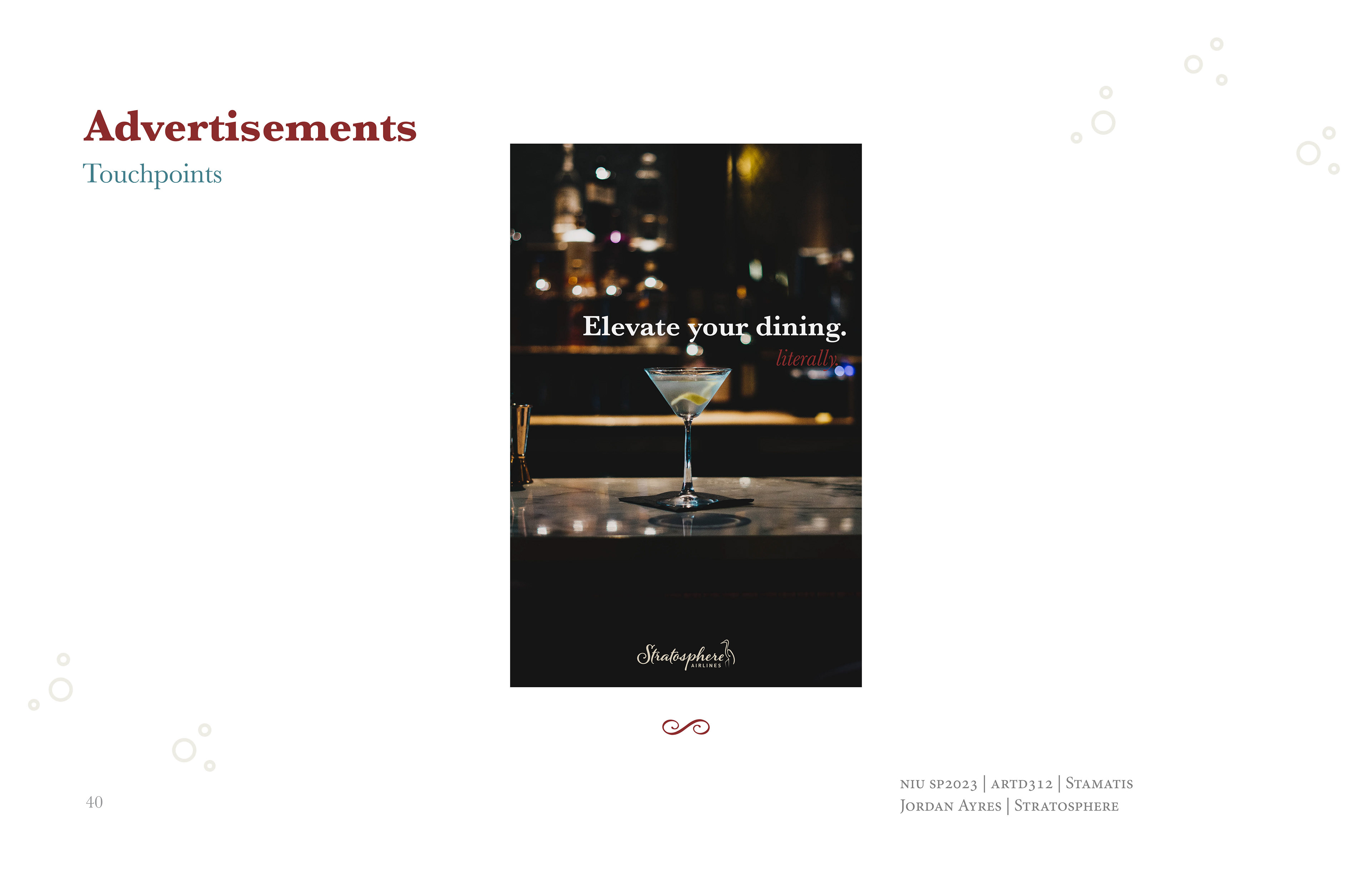
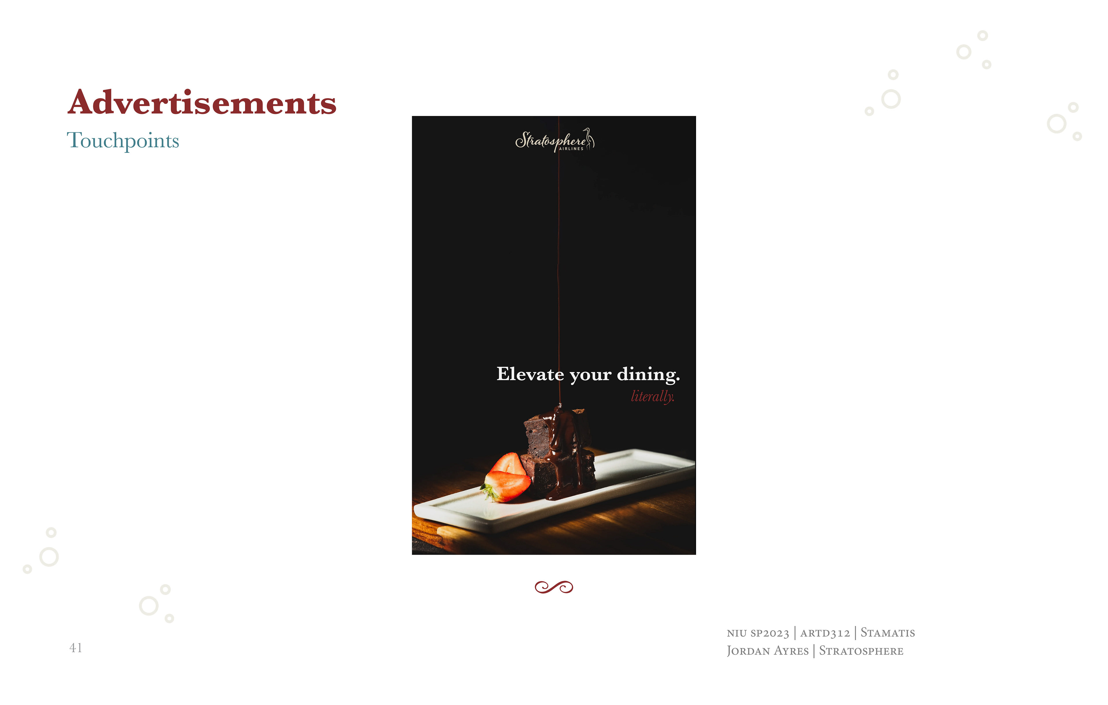
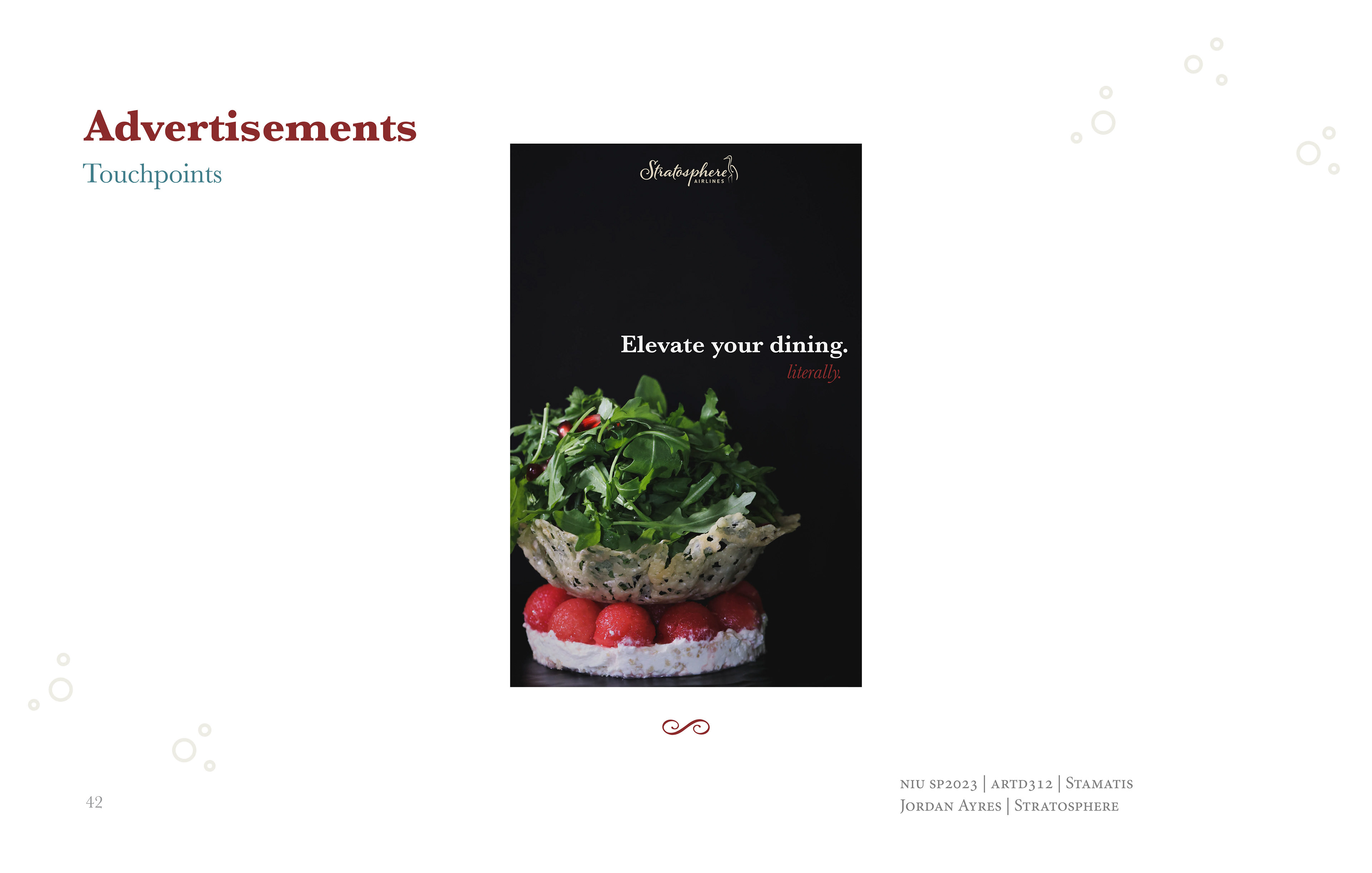
To elevate the brand's sense of high-class living and create a dramatic impact, I employed low-light, dramatic imagery in the branding materials. This approach not only highlights the luxury and exclusivity of the airline but also effectively makes the chosen color scheme stand out.
The Stratosphere branding project was designed to set a new standard in airline service, emphasizing the integration of luxury dining with travel. The comprehensive visual identity supports a cohesive and distinctive brand experience.